
If an executive dashboard exists but decisions still feel unclear, contact The Information Lab at info@theinformationlab.com.
One of the most common issues I see in executive dashboards is not technical, but conceptual.
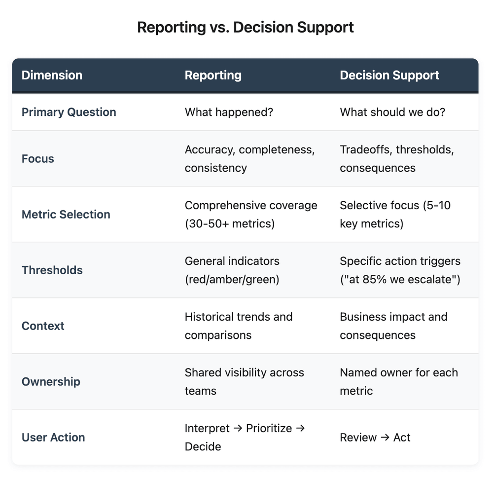
Most dashboards are good at answering and creating a visual representation of what happened. Far fewer are designed to provide direction on what action should be taken.
Reporting dashboards prioritize accuracy, completeness, and consistency, while executive dashboards prioritize decision support by presenting tradeoffs, thresholds, and consequences.
Executives can look at a dashboard, understand the performance for a previous period, and still be unclear on:
Where their attention is required
What decisions should be made
How changes in metric performance should impact decisions
The inability of dashboards to guide decision-making is where most executive dashboards quietly fail.
When dashboards stop at reporting, the burden shifts to the executives to interpret, prioritize, and translate insight into action. Some leaders can, but should they have to?
The Question That Changes The Conversation
Dashboards that support decisions start with a specific question:
What decisions is this dashboard meant to inform, and when?
That question will change what dashboard gets built.
Executive dashboards require:
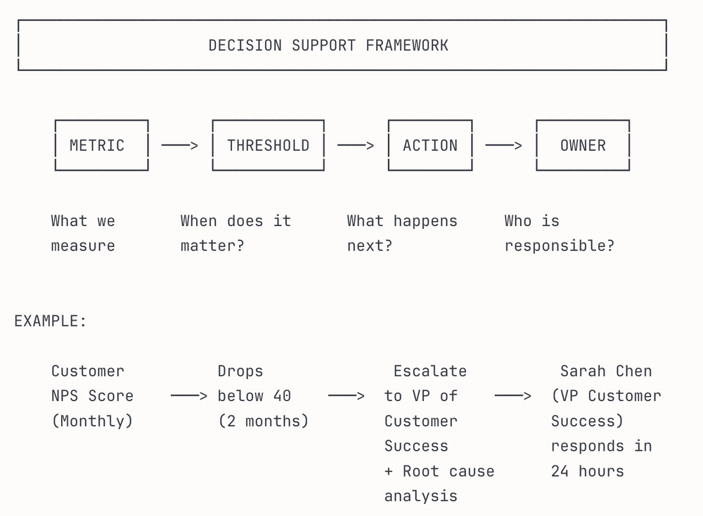
Targeted metrics: It is more valuable to select a few targeted metrics (e.g., five targeted metrics rather than 10 popular ones). Metrics should be chosen because they inform decisions, not because they are popular or interesting to track.
Clear thresholds: Avoid just showing red, amber, and green alerts. Quantified thresholds linked to specific actions, such as "at 85% we escalate to the Operations Manager or at 65% we halt new projects," provide specific criteria that remove interpretation.
Focus on business impact, not just metrics: The value for executives is showing the business impact, not just the metric. For example, showing that a five-point drop in Net Promoter Score correlates to $2M in churn risk next quarter, or that current backlog levels will delay launch by six weeks. Executives should not have to guess whether a 5% churn rate is worse than a 15% delay in delivery.
Explicit ownership: Each metric should have a designated owner. The owner is an individual responsible for answering questions like, "What are you doing about this?" Metrics on a dashboard without owners become the executive’s problem and no one's responsibility.
What This Looks Like in Practice
I have built and contributed to analytics frameworks in financial services and enterprise environments. I have noticed a consistent pattern: the most valuable dashboards are rarely the most comprehensive ones.
Strategic Performance: Eliminating Manual Aggregation
I worked with an enterprise client to build a performance-tracking system to support strategic objectives across divisions. Previously, teams manually reported progress, often in disconnected spreadsheets with inconsistent formats and limited data validation. Leadership had no unified view, and teams had no standardized way to report status.
We designed a data pipeline and a subsequent centralized dashboard with three decision layers:
Executive view: High-level progress against strategic objectives
Divisional view: Team-level goals with ownership and status
Metric view: Specific KPIs tied to each objective, with thresholds
The system not only eliminated manual reporting but also gave divisions real-time visibility into their performance and allowed leadership to identify misalignment early, before quarterly reviews.
The dashboard avoided the trap of showing everything, instead it showed what mattered for decision-making.
Why Most Dashboards Are Stuck in Reporting Mode
Most analytics teams build what is measurable, then rely on executives to figure out what is actionable.
There are some common reasons for this:
Stakeholders usually ask for "visibility." Executives often request dashboards without precise requirements outlining the decisions they are trying to make. The results are dashboards that track every meaningful metric, but don’t zoom in on those metrics that drive decisions.
Overemphasis on training for technical accuracy. Building a reliable data pipeline, ensuring consistent definitions, and validating calculations are hard skills. These are the core skills of an analyst; generating insights that drive decisions is also an essential skill. A technically accurate dashboard that does not drive decisions is a costly deliverable that adds no value at the executive level.
The safe presentation of facts vs recommending action. Presentation of facts is a safe approach; however, defining thresholds and ownership means taking responsibility. What if the threshold is wrong? What if the metric doesn’t provide insights? Many analytics teams avoid this risk by staying descriptive.
Decision support requires standing behind a recommendation. It means saying, "If this metric exceeds a threshold, here is what we believe should happen."
In my experience, the teams that make this shift in thinking see increased value outcomes at the executive level. Less time is spent in meetings interpreting the dashboard, and more time is spent discussing action items and timelines.
The Test
A simple test that can be applied:
If a dashboard were not available tomorrow, would the decision still be made the same way?
If the answer is yes, it may be informative, but it does not support decisions.
The best executive dashboards do not just inform users; they direct users.
Where to Start
If you are responsible for an executive dashboard, here are three questions to ask:
What decision is this dashboard meant to inform? If the answer is vague, be more specific. A dashboard that tries to support five decisions usually becomes crowded and supports none.
What would the user do differently if this metric moved above or below a 10% threshold? If the answer is "nothing" or "it depends," the metric probably does not belong on an executive dashboard.
Who owns the response when a threshold is exceeded? If there is no owner, there is no accountability. The metric loses its value and becomes decorative.
Decision support in executive dashboards is not about more data. It is about providing direction on which actions to take.
If your company needs support designing executive dashboards that drive decisions, reach out at info@theinformationlab.com.